Heleo
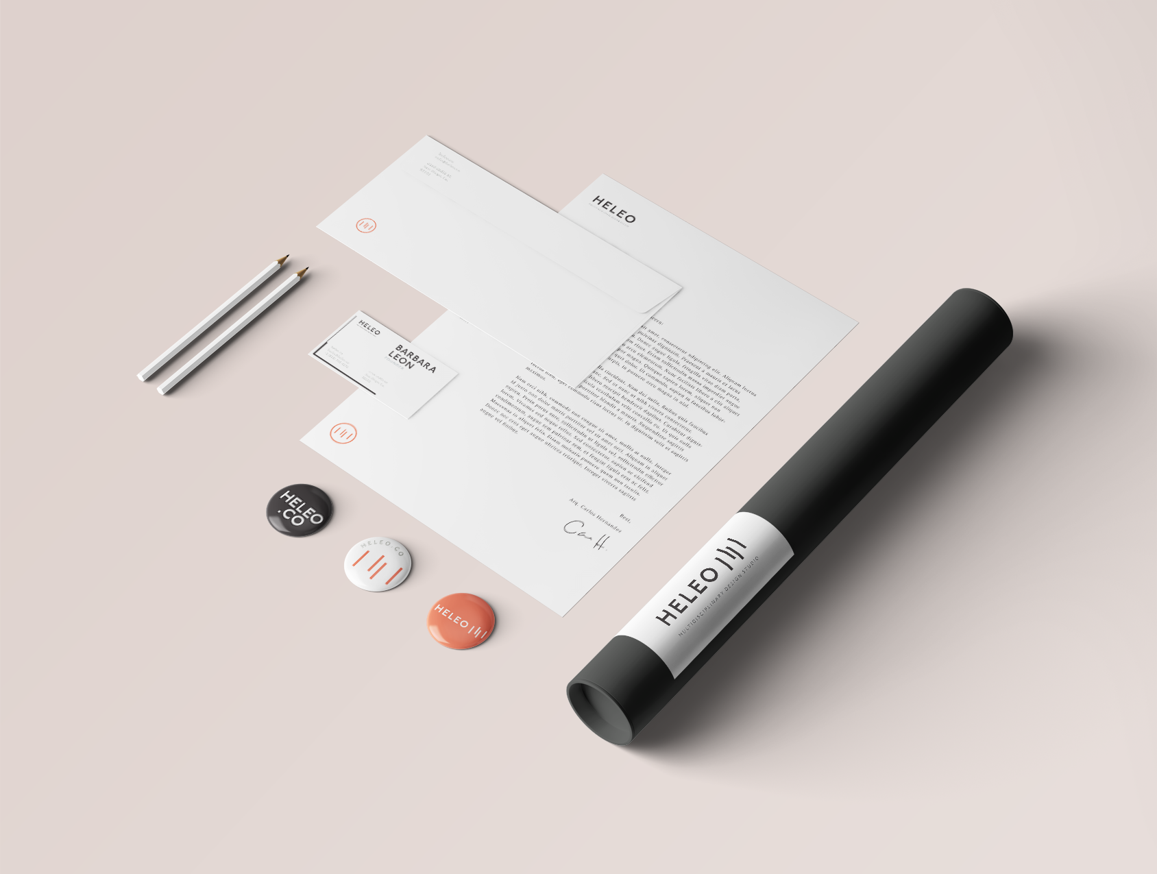
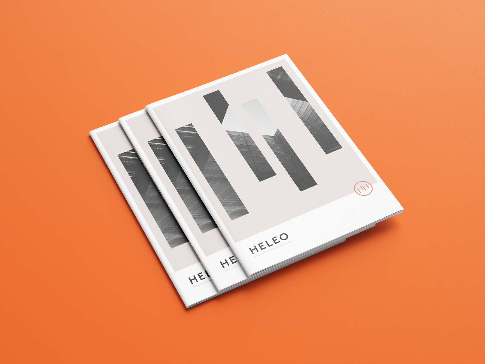
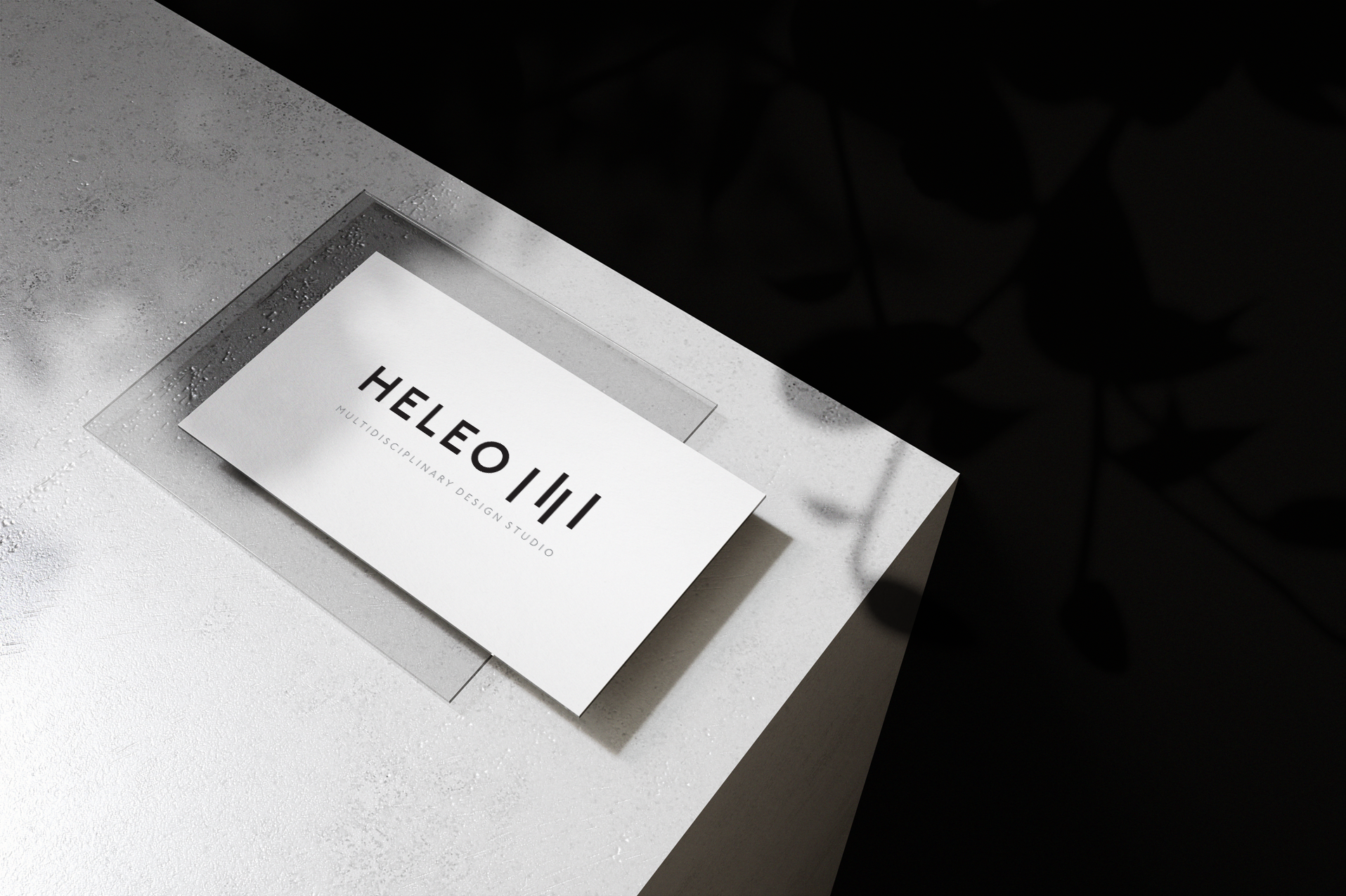
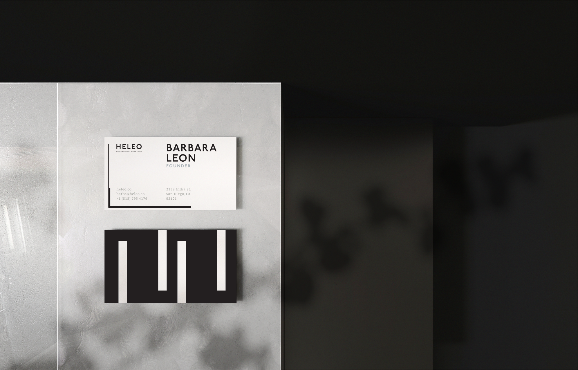
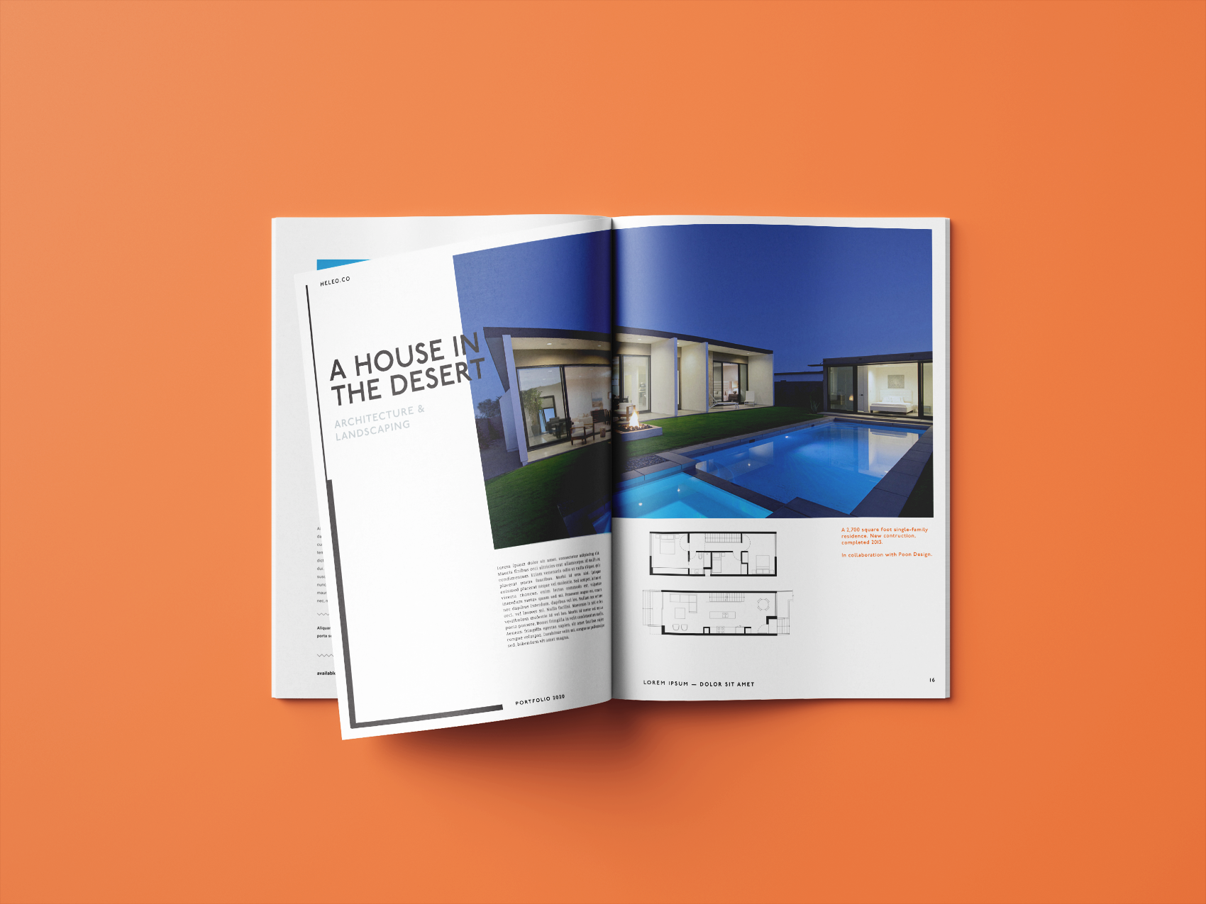
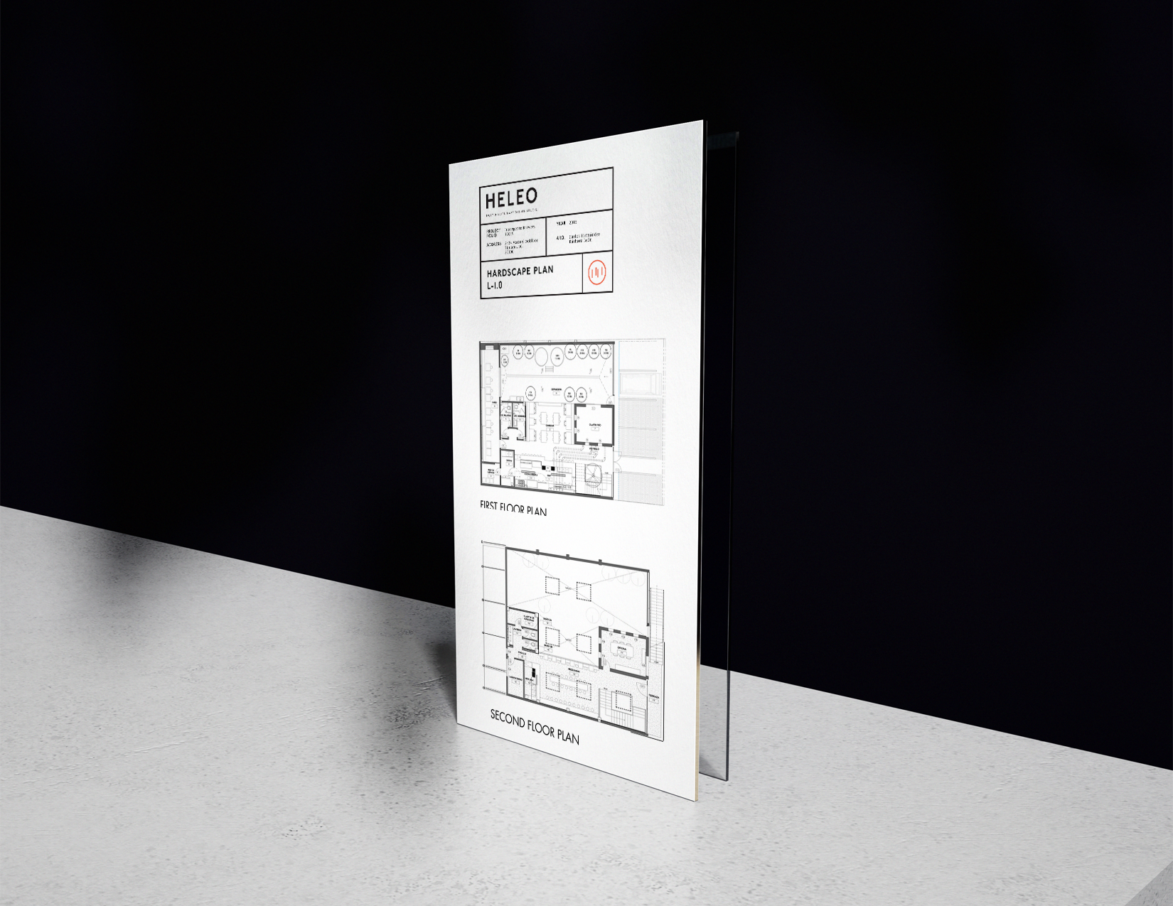
As a multidisciplinary design studio, Heleo's identity is built around the four core disciplines that define its practice, represented by the four vertical marks within the logotype. The visual system balances structure and flexibility, pairing refined serif typography with clean sans serif typefaces to create a sense of both creativity and precision. Dynamic typographic hierarchy reflects the studio's adaptable approach to each project, while a restrained neutral color palette ensures the work itself remains the focal point. The result is a timeless identity that is confident, understated, and designed to evolve alongside the diverse range of clients and creative solutions the studio delivers.