Labolab
A word-play between the spanish “lavo” (wash) and “lab” made the perfect and catchy name for this thoughtful brand.
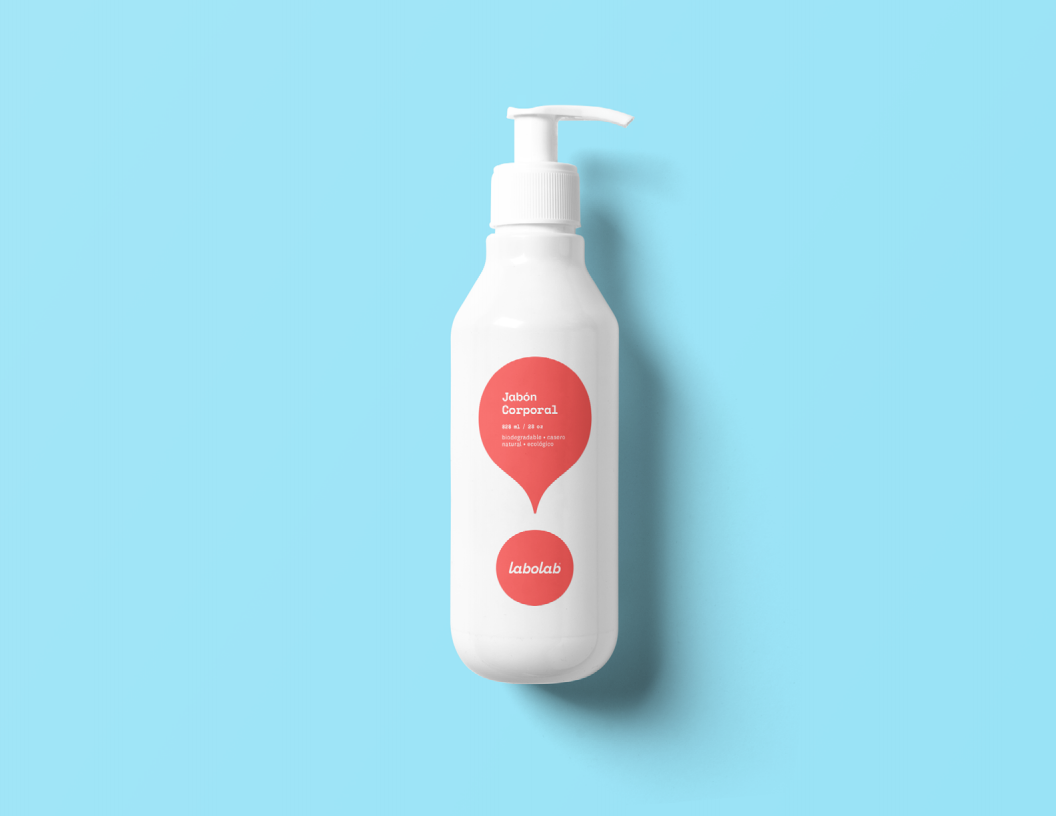
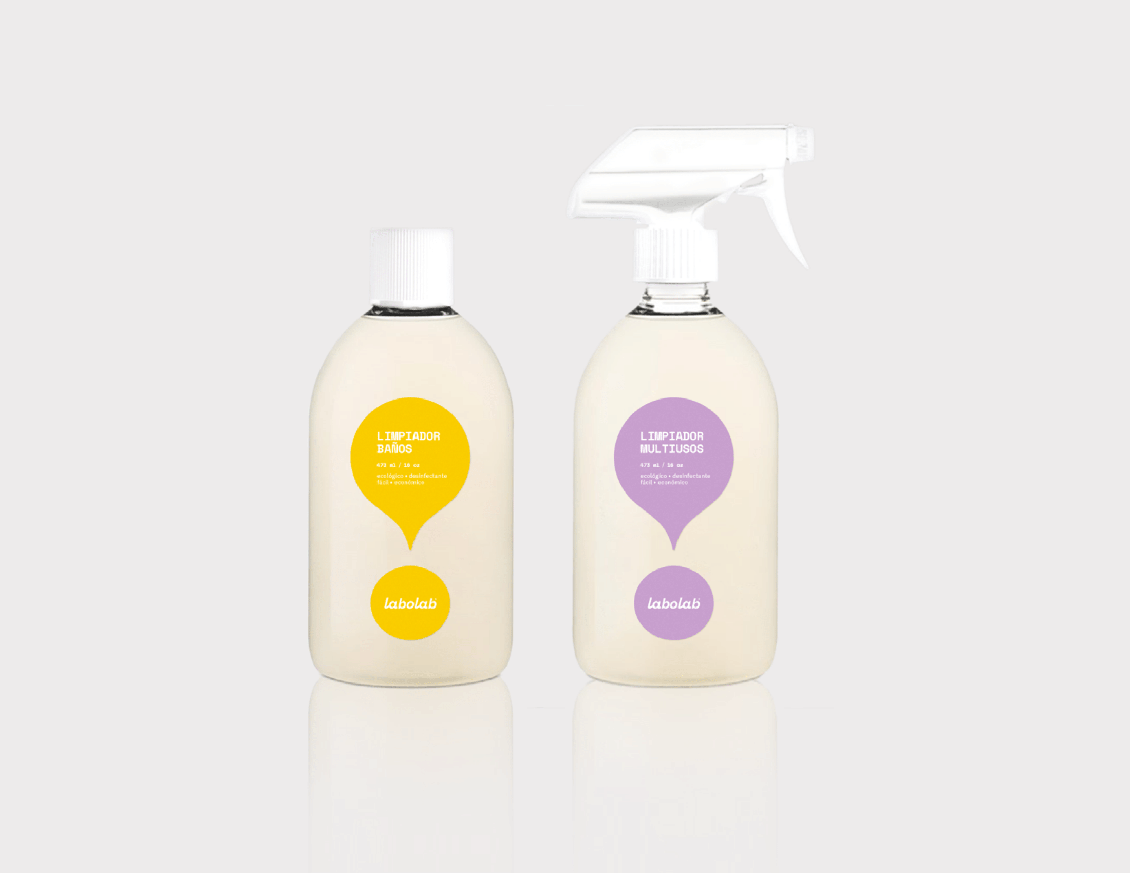
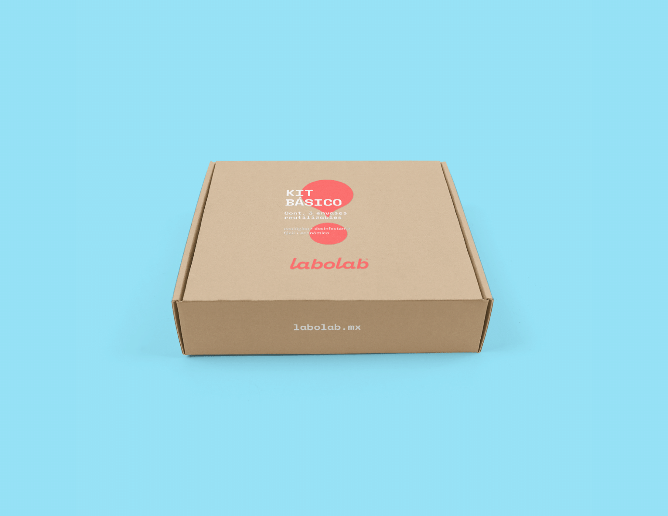
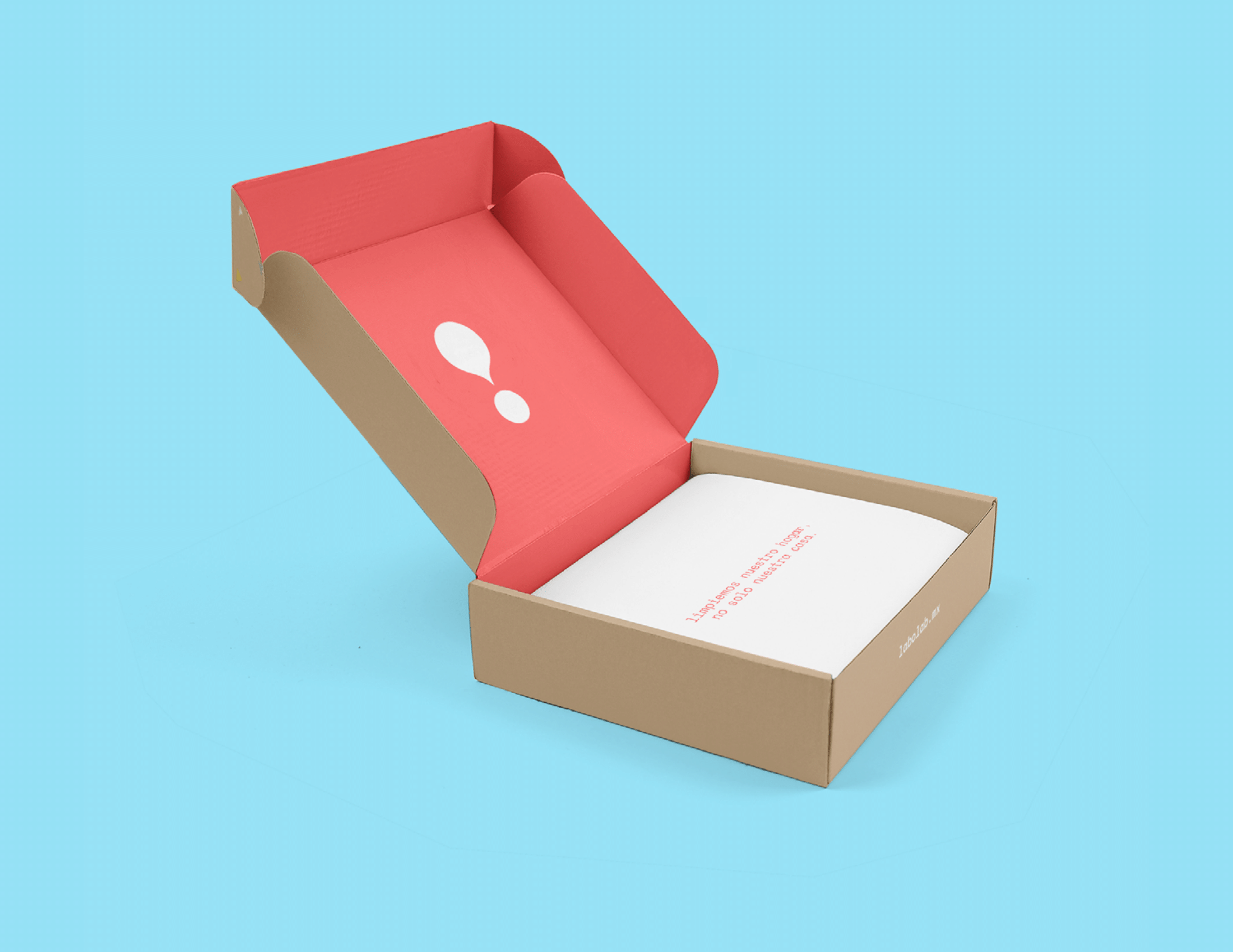
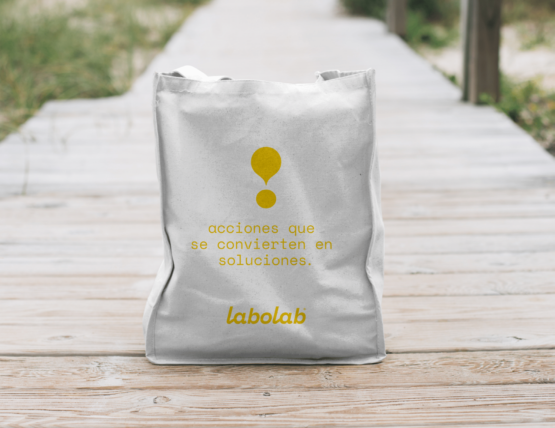
We approached this identity as a balance between science and softness—honoring the effectiveness of cleaning products while expressing their gentle impact on the planet. The visual system is built around simple, modular shapes inspired by drops and measurements, subtly referencing both formulation and care. A restrained palette of clean white and airy blue against fresh and optimistic coral and yellow, brings warmth to a category often dominated by harshness.
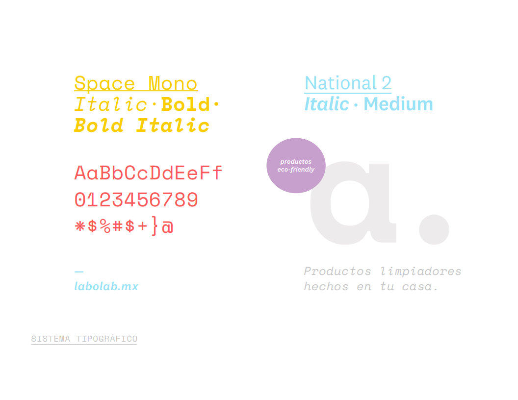
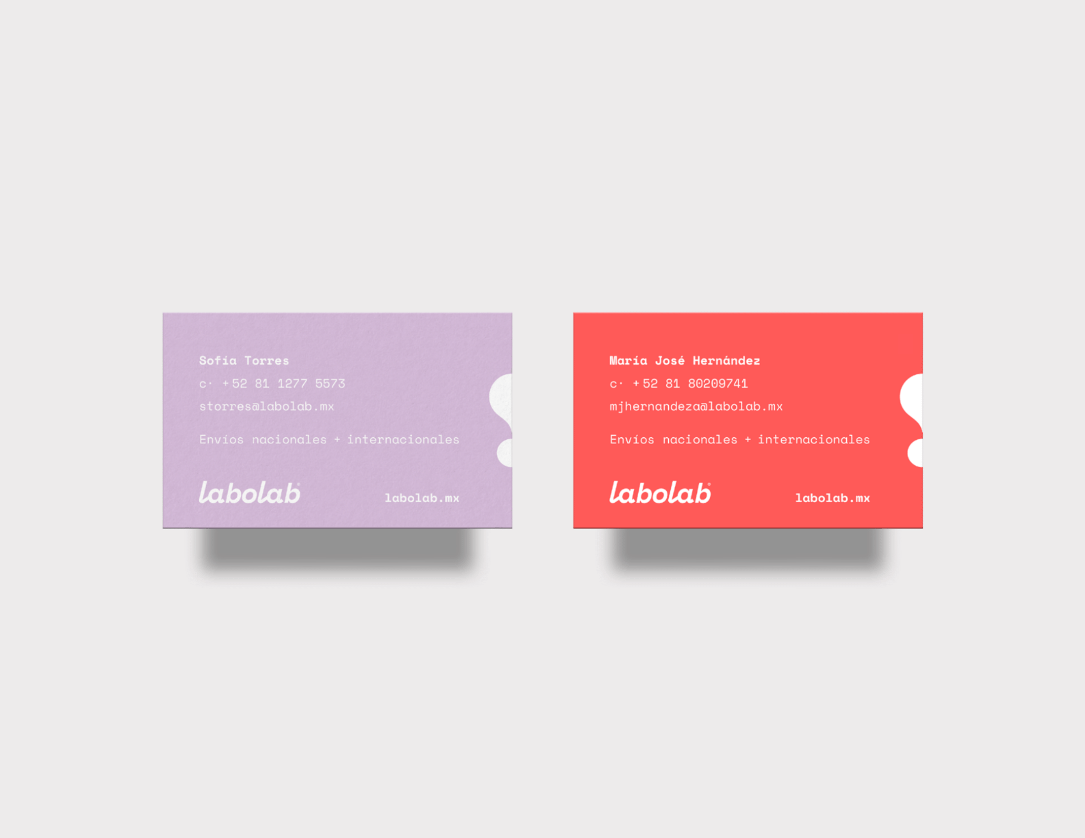
The typography is approachable and human, reinforces transparency and trust, while the minimal layouts allow the product and its purpose to breathe. Across packaging and touchpoints, every element was designed to feel reusable, honest, and quietly confident—proving that eco-friendly doesn’t have to look clinical, and that thoughtful design can make sustainability feel like a natural, everyday choice.